the big iPad note-taking-and-doodling app roundup
Ever since I got my iPad, I’ve felt like it should be possible to use it to take down a lot of ideas for my D&D campaigns. Unfortunately, nearly every time I’ve tried to do so, it’s been a big disappointment.
I use Scrivener to store my campaign notes. It’s great, and it’s definitely made my life as a DM easier. I remembered reading about using the Scrivener “sync to file” system to edit a Scrivener document on an iPad, so I got to work trying that out. I figured I’d sync my campaign notes to a directory of files in Dropbox, then edit them with WriteRoom. The problem was that I just couldn’t get anything other than the text into WriteRoom. I needed to get in structure and both sides of each card. (If you use Scrivener, you know what I mean. Every document is an index card with a short synopsis on one side and the full document on the other.) Unfortunately, syncing to files didn’t get me any of that. It certainly didn’t get me links, formatting, or tags, although I could have lived without those.
Then I remembered that there was some fanfare when Scrivener got support for syncing with Index Card, another app that let you organize your big documents onto index cards with synopses on one side. I absolutely agonized over whether to spend the $5. (This, despite the fact that I paid $9 for a hamburger last week.) Anyway, eventually I did buy it, and it turned out that I would’ve preferred half a hamburger. The sync experience was very clunky, not seamless. The way the front/back card sync worked was a mess. The structure of the document wasn’t synced usefully. It was a mess. The software looks quite similar, but their storage models differ just enough that it doesn’t look like they’ll be reconciled any time soon. Instead, I’m pining for Scivener for iOS, due at earliest 2012 Q4.
For writing campaign ideas, I’ve stuck with just using WriteRoom and, later, copying and pasting the content into Scrivener. It’s sort of horrible, but it works decently. What I like especially is that WriteRoom syncs very well with Dropbox, and I can move from editing the file on my iPad on a crowded bus to editing it on my phone while walking home. I’ve especially enjoyed using Siri to dictate ideas into WriteRoom while watching where I’m going.
Still, I wanted more. I wanted to sketch out maps or plot charts or NPC relationships. On my Mac, I might use OmniGraffle for this sort of thing, but OmniGraffle for iPad costs as much as a really good bottle of bourbon, and I didn’t see myself getting as much utility from the app as from the booze. I figured the next best thing would be something to let me do freehand doodling.
Penultimate
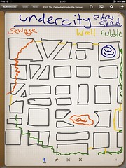
It was okay. I scribbled out some maps, but its limitations became very clear very quickly.
- good: simple; easy to use
- good: can pick different “paper” for each page
- good: can make my own paper; I made hex maps and character sheets!
- bad: the only drawing tool is “line”
- bad: precision of lines limited by touch screen sensitivity
Remember, it doesn’t matter how many gigapixels the iPad has on its amazing retina display. The finest-pointed touch it can register is roughly the size of Detroit. Even with a stylus, you can’t draw fine lines or handwrite nicely at small sizes.
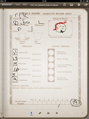
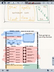
Each page in a Penultimate notebook has a background image, which is its “paper.” The app comes with some paper and you can buy other kinds. I made my own paper. Making hex paper drove me to learn about mkhexgrid, which is quite powerful. I also imported a scan of the B/X D&D character sheet and filled in a character on it. This was fun, but in both cases, I was really handicapped by my inability to draw fine lines or write small text. I went back to looking.
Paper by Fifty-Three
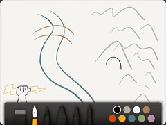
Just a few days after I’d gotten started with Penultimate, they were acquired by Evernote. I am not a big fan of Evernote, but the acquisition didn’t make me angry or worried. It just led me to read an article about the acquisition, which linked to Paper. Paper is a gorgeous little app with a lovely interface. My little doodles came out looking cute and distinctive. The app’s also free, as long as you don’t want most of its writing tools.
Unfortunately, it didn’t really have any benefit to me over Penultimate. It seems great for drawing, but I didn’t want to produce art. I wanted to make doodles and maybe maps or scribble down notes. I couldn’t write more precisely with Paper. I couldn’t even change the paper background. So, Paper was out of the running.
Skitch for iPad
I’ve been a big fan of Skitch since I first learned of it. I use it for taking screenshots to show to QA at work. I use it for making image macros. It’s the only image-editing program I ever felt was stupid enough for me to use without cursing. Evernote bought Skitch, too, and has been slowly making it more annoying to use… but so far, it’s still pretty great. I was glad to see that there’s Skitch for iPad.
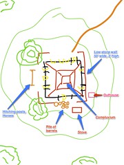
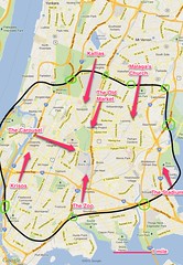
I immediately installed it and drew a map for my Mazes & Minotaurs campaign. It was great. It had a text tool, so I could finally just put some text on the screen, edit it again, and move it around. Heck, I could move around anything I drew, because it’s all vector-based. When I didn’t like some of the walls I drew on the bandit villa, I tapped on them and moved them around. Maybe the most important tool, it turned out, was the arrow tool. I drew all kinds of arrows to stuff, which let me make callout labels.
It has some other weird features, too. I could bring up a full-screen map view, snap it, and doodle on that. I used that feature to make a map of the huge city of Alithica in my B/X campaign, and it was a huge time-saver.
Skitch could probably be my go-to app for this stuff if it wasn’t for some truly bizarre problems.
- all text has a thick white-or-black outline; you can’t pick which
- all text is wrapped by inserting hard line breaks
- there’s no way to erase portions of an imported image; coloring over with white makes a big overlaid vector line
- there’s no way to break up a big line; Skitch on Mac has an eraser
- the “save to Evernote” dumps a rendered image; you can’t sync the vector data or with Skitch on Mac
- the only way to search for a map is to “fine me” otherwise, drag and zoom — there is no way to enter a place name for which to search
- there’s no fill tool (which Skitch on Mac has)
- there are only eight colors
- there’s no way to organize images; they’re just a big pile
Skitch for iPad has a lot of promise, but these problems are pretty huge.
Even though I’m clearly going to keep making annotated maps in Skitch, I kept looking.
Noteability
I saw a bunch of sites talk about Notability, often comparing it to Noteshelf. Mostly, people seemed to say that Noteshelf was a bit better, but it also cost $6 and Notability cost $1. I bought Notability.
First, the bad parts:
- custom backgrounds, but they’re per-notebook, not per page
- unbelievably slow redraw speed when you flip from page to page
- too many buttons and a generally not-quite-right UI
- really weird organization system (categories, subjects, etc.)
- generally feels amateurish in UI design
- no arrow tool!
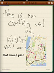
…but man, other than that, it turns out to be pretty sweet. It lets me add images and text and then edit them and move them around. I have a lot of control over how they work. I can highlight parts of an image and the highlighting moves around with the image, but can also be manipulated on its own.
There’s a “zoomed writing” feature. You drag a rectangle over part of the page and it appears, greatly magnified, at the bottom of the screen. Then you can write on that magnified portion. This means you can write on the paper in a much smaller hand, getting a much larger amount of writing onto the screen at once.
All of the lines made in Notability are vectors, and they can be reselected after drawing, then restyled (made thicker, thinner, bluer, etc) and moved. Since handwriting is just lines, this means that you can select hunks of writing and move them around later, reorganizing your handwritten notes as needed. Great!
Despite my ongoing annoyance with Notability’s weirdness, I keep using it. It’s been the most useful thing for doing the actual job: letting me jot down notes and sketching and think about them.
Noteshelf
So, what about Noteshelf? I read so often that it was better than Notability that I finally couldn’t help myself. I bought it. The verdict? In brief: meh.
Its interface elements are much more polished-looking than Noteshelf’s, but they’re not actually better in practice. A lot of it seems to boil down to Noteshelf using bitmapped drawing instead of vector. I can’t editing my work nearly as easily. I can’t restyle lines. Moving them is awkward and requires that I cut and paste. There’s not even an arrow tool!
The big improvements of Noteshelf over Notability, though, are worth mentioning. It lets you set a per-page background, which is good for forms or maps. It organizes pages left-to-right with one page displayed at a time. Notability puts pages end-to-end, continuously, which ends up feeling awkward. It’s also just generally easier to use and feels less laggy and awkward. Still, I’d rather deal with the occasional weirdness of Notability than with the serious lack of features in Noteshelf.
The Verdict
I’m going to keep using WriteRoom, Skitch, and Notability for a good long while. It’s really clear, though, that I could be moved to use only Notability if it just gets one or two things… like an arrow tool. (Also, I’d love a few other shapes, like squares and circles and straight lines.)
Skitch seems unlikely to ever catch up with Notability. They’ve got too many fundamental problems. To be fair, I think one of them is “Skitch doesn’t want to be what Rik wants it to be.”
Noteshelf seems unlikely to catch up either, if only because I’d be amazed if they switched from bitmapped to vector lines.
What I am left hoping for, then, is that Notability will get slicker, faster, and an arrow tool.
